
SpeedMoe helps non-professional track day organizers run smoother events by simplifying group management, streamlining feedback, and keeping drivers connected. Focus stays on safe, engaging driving.
My Role: Design Lead, Product Management
In recent years, more and more people have become enthusiastic about participating in motorsports, leading to a significant increase in track day attendance. This surge in participation, combined with inconsistent or unclear user group classifications, has resulted in mismatches in vehicle performance and driver experience levels, further exacerbating traffic and safety concerns on the track.
We conducted a user survey with over 120+ participants across multiple track day events organized by different hosts.
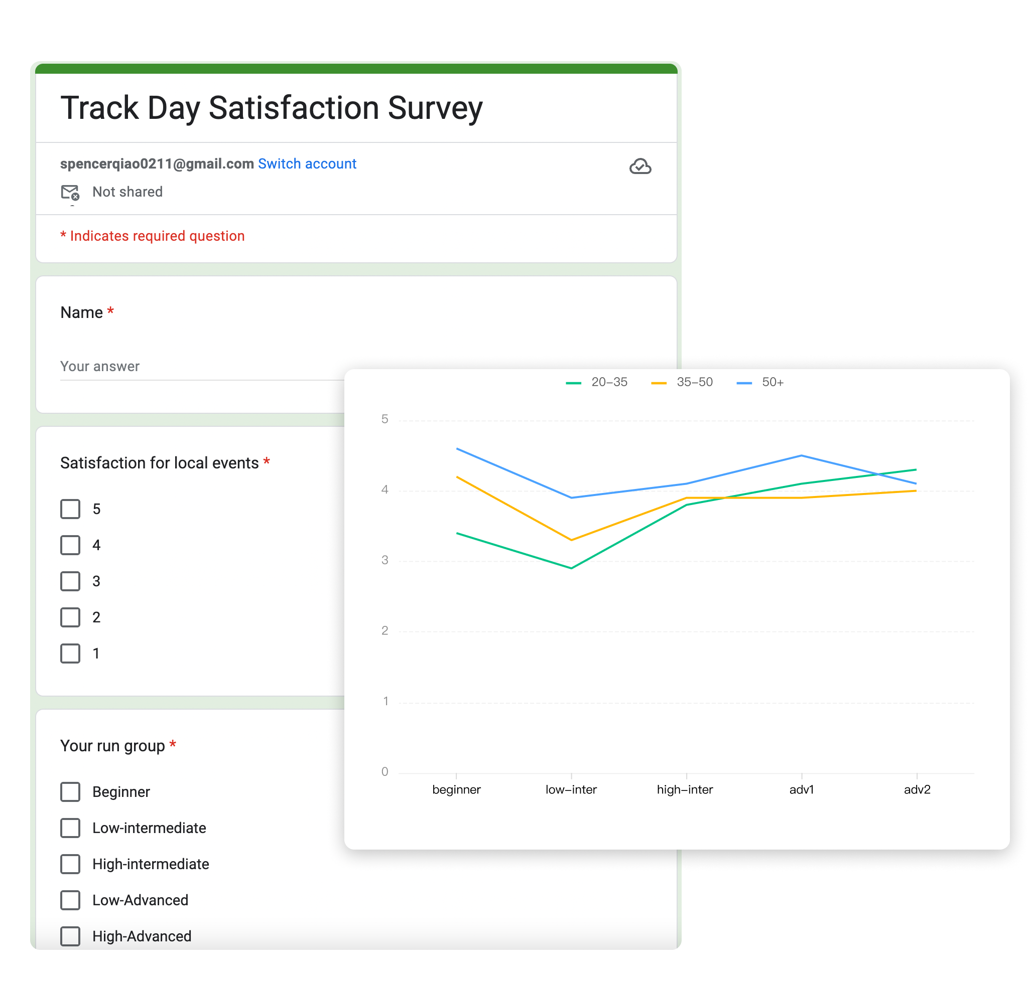
We interviewed a selected group of drivers from various backgrounds to explore their experiences in more depth.

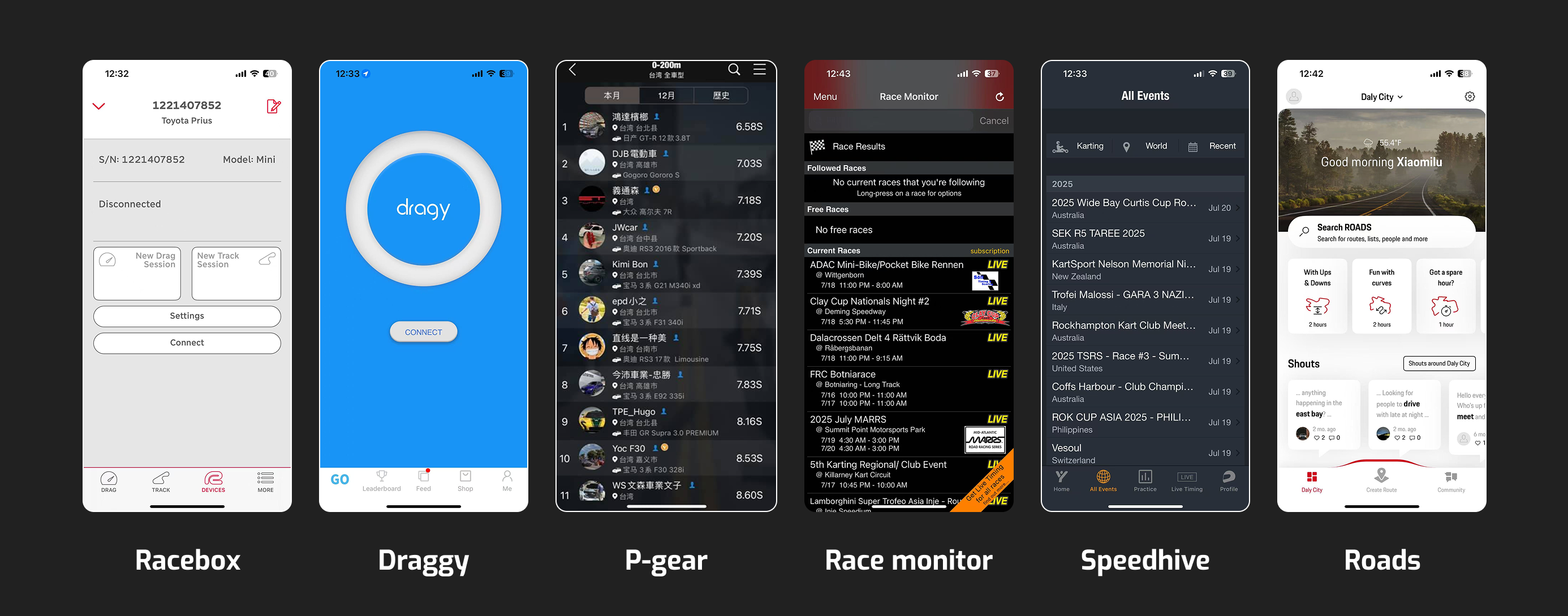
Our competitive products are either hardware or personal timing tools, or result-viewing/social platforms. None of them combine organizer operations, driver collaboration, data-driven grouping, and safety with engagement into a unified ecosystem; as a result, they cannot fundamentally improve grassroots track day efficiency, on-site safety, or long-term community growth.
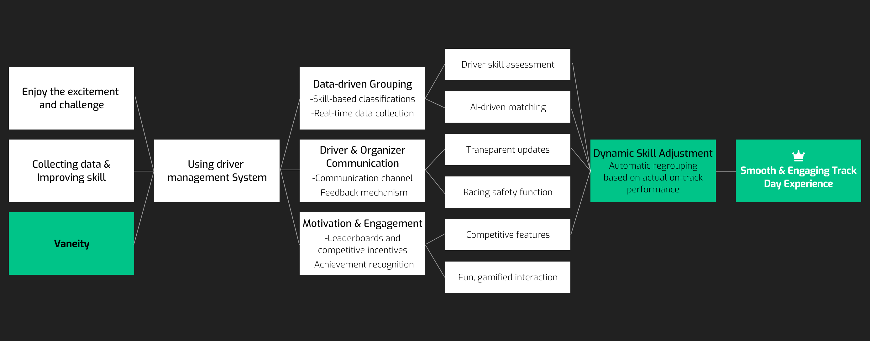
Leverage real-time feedback, playful challenges, and social visibility to keep users engaged, motivated, and feeling seen.
Gamify progress tracking → turn steps from registration to racing into dynamic goals
Live feedback loop → drivers & organizers stay connected
Enable social comparison → rankings, challenges, rivals
→ Maybe expand into community features & collaborate with brands?
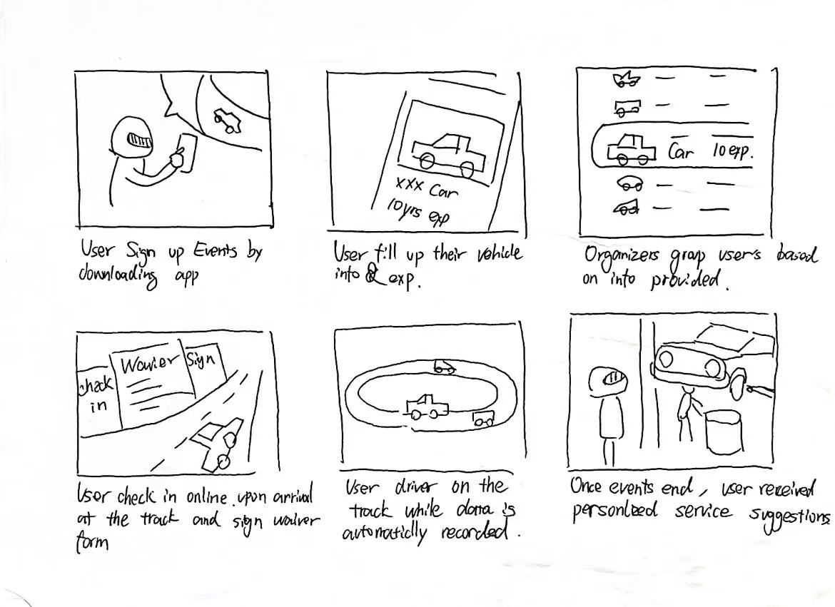
This storyboard maps the full user journey and highlights how our app enhances the track day experience—while generating potential income through service integration and smart user targeting.
For now, we have decided to focus on building the user-facing side of SpeedMoe as both a website and a mobile application. This allows us to validate core features—registration, communication, grouping, and feedback—directly with drivers and organizers, while keeping the experience accessible and easy to adopt across different devices.
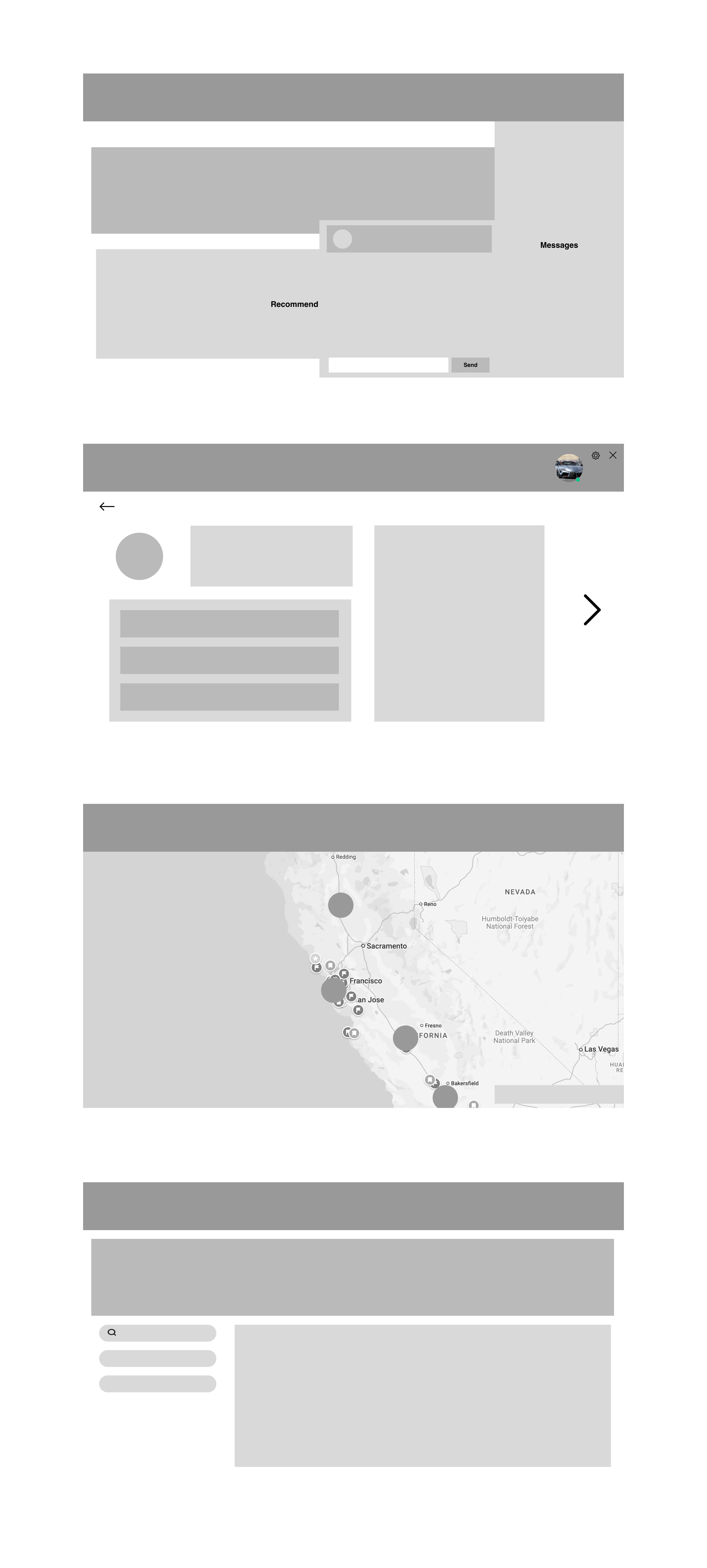
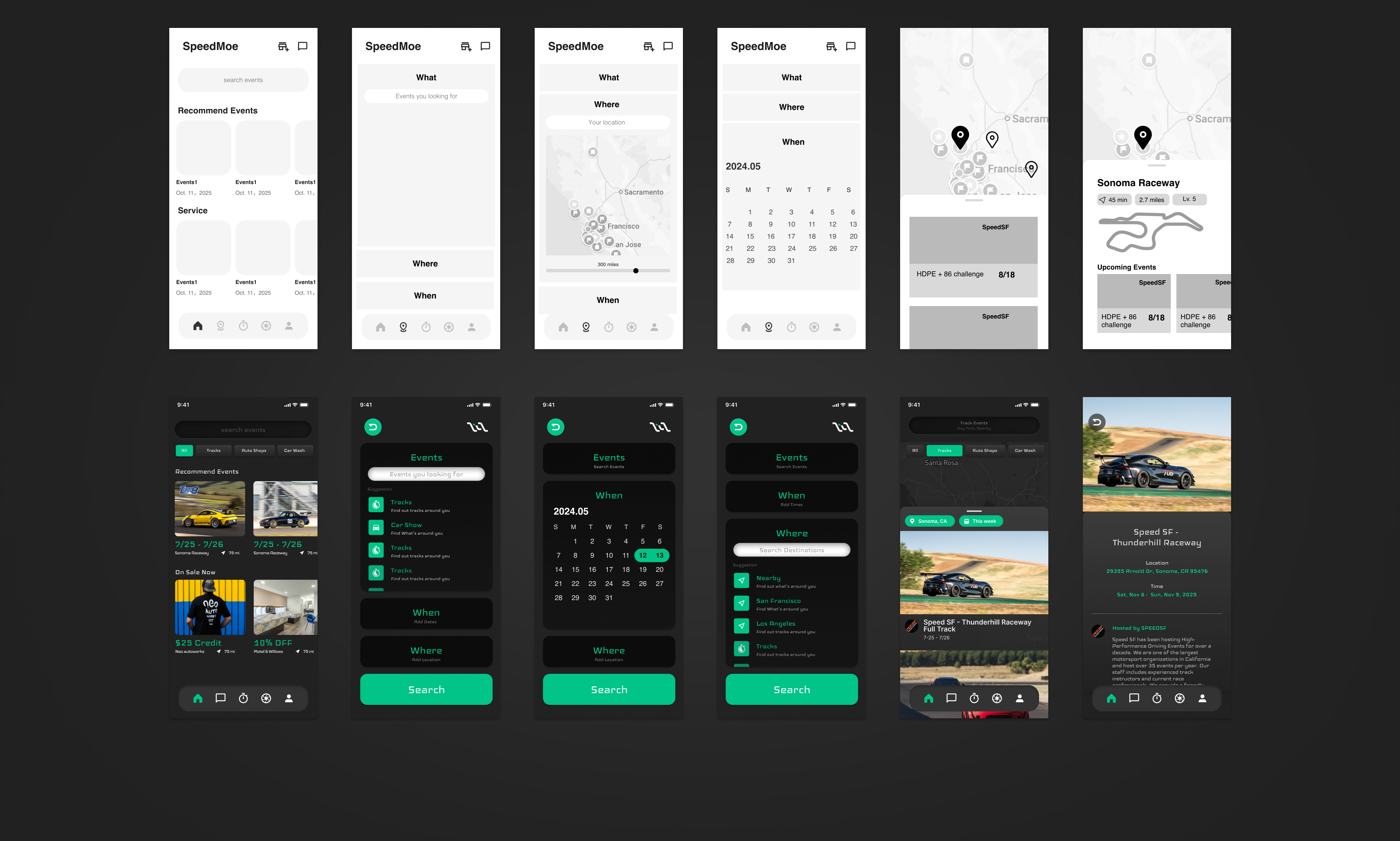
Low-fidelity prototypes were created using quick sketches and wireframes to explore core user flows and test interaction concepts. This stage focused on validating ideas and usability at low cost, enabling fast iteration before moving into detailed visual design.
Website Protypes:
Mobile Protypes:

We recruited 7 potential users to conduct usability testing across multiple real-world scenarios. These included event sign-up flows, pre-session waiting areas (paddock), and even simulated hot pit environments during live sessions(Thanks for Turn8). Testing our model in these varied contexts provided valuable and inspiring feedback that revealed key areas for improvement and confirmed several design assumptions.

After thar, we started to design the UX Iteration 1 after my initial sketches. And optimized the interface based on our experience and feedback from previous events.
Website Protypes:
IOS Protypes:
We invited 10 Participants to test our prototype 1 and we received two key pieces of feedback:
1. As a motorsport-related app, it lacks excitement and distinctiveness—it needs a cooler, more engaging appeal.
2. The website flow is overly complicated and should be streamlined for easier navigation.
3. We need a B-side platform for organizers to control registration, grouping, scheduling, and safety, fully connected to the user-facing web and mobile app.
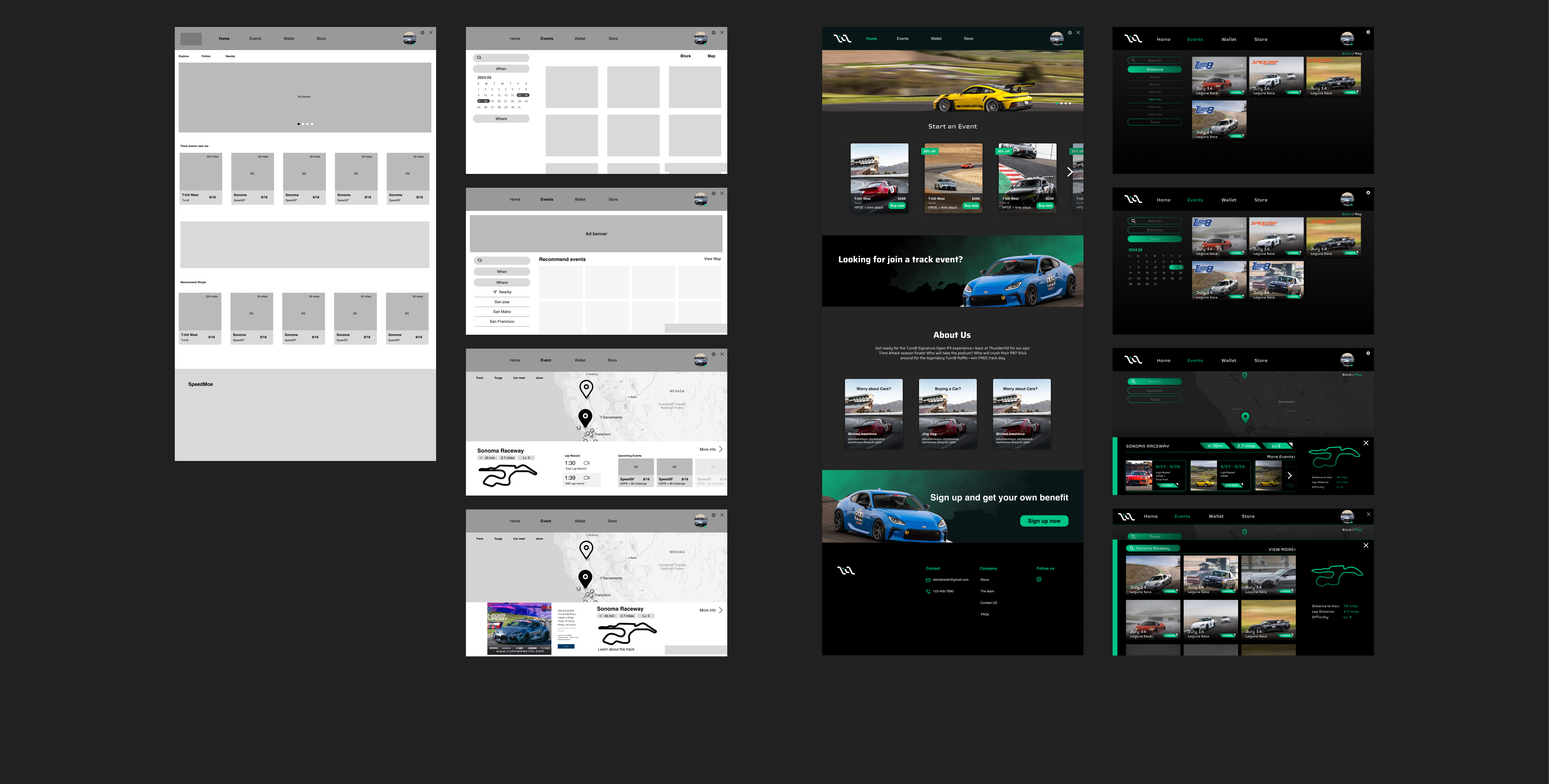
We took their feedback seriously and made several key changes. In the app, we introduced motorsport-inspired elements such as carbon fiber textures and racing-themed visuals to enhance the overall vibe. We explored several design variations and ultimately selected the one that felt the boldest and most dynamic. At the same time, we refined the overall UI and simplified the user flow to make the experience smoother and more intuitive.
IOS UI Enhancement Variations

Web UI Enhancement
We refined the web UI by adopting a darker color palette paired with our signature green to create a sleek, high-contrast look. The typeface was updated to Iceland, adding a bold, futuristic edge to the overall aesthetic. We redesigned the buttons with sharp corners to emphasize a more high-tech feel. Carbon fiber textures were used throughout the interface to give the site a cooler, motorsport-inspired appearance.
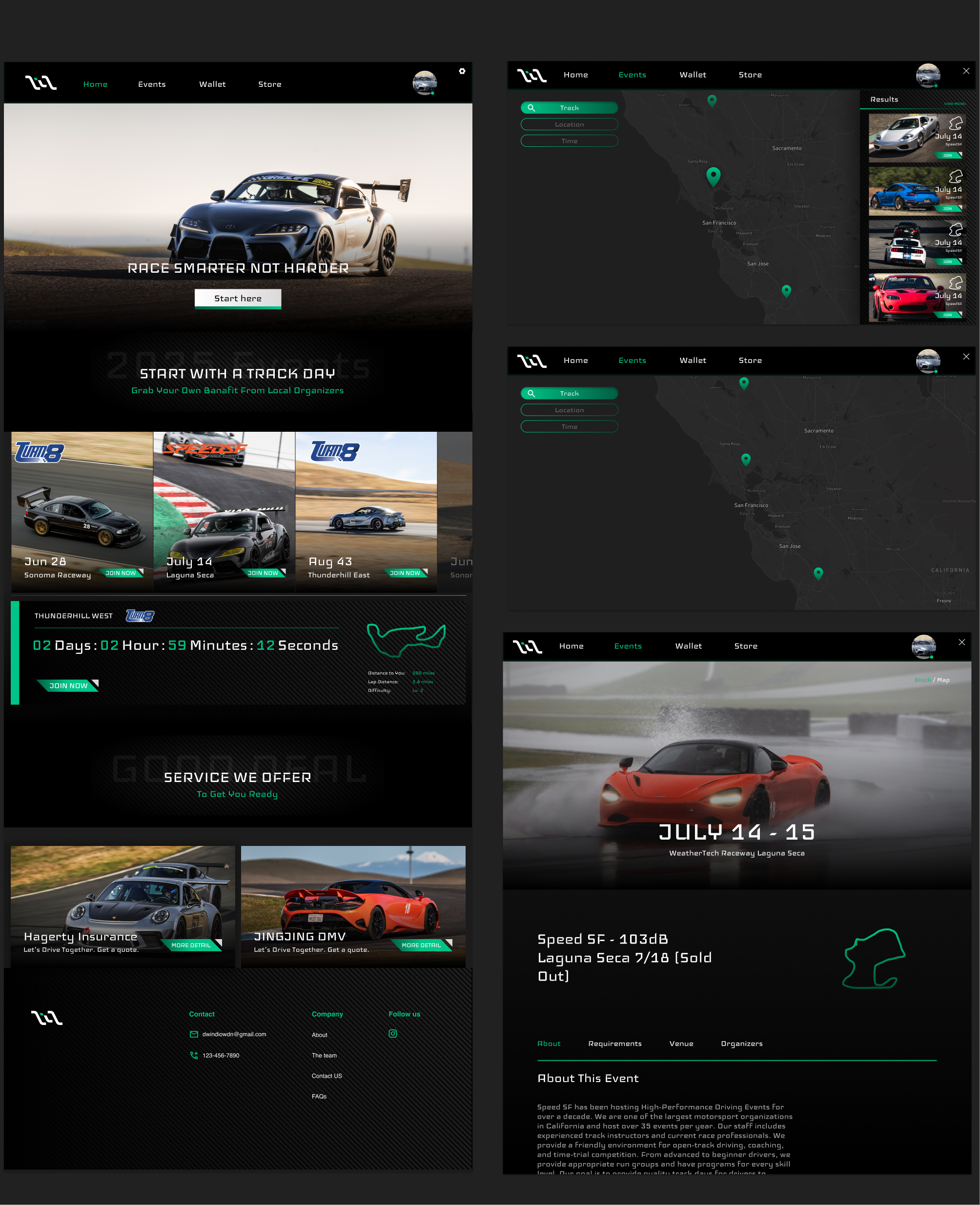
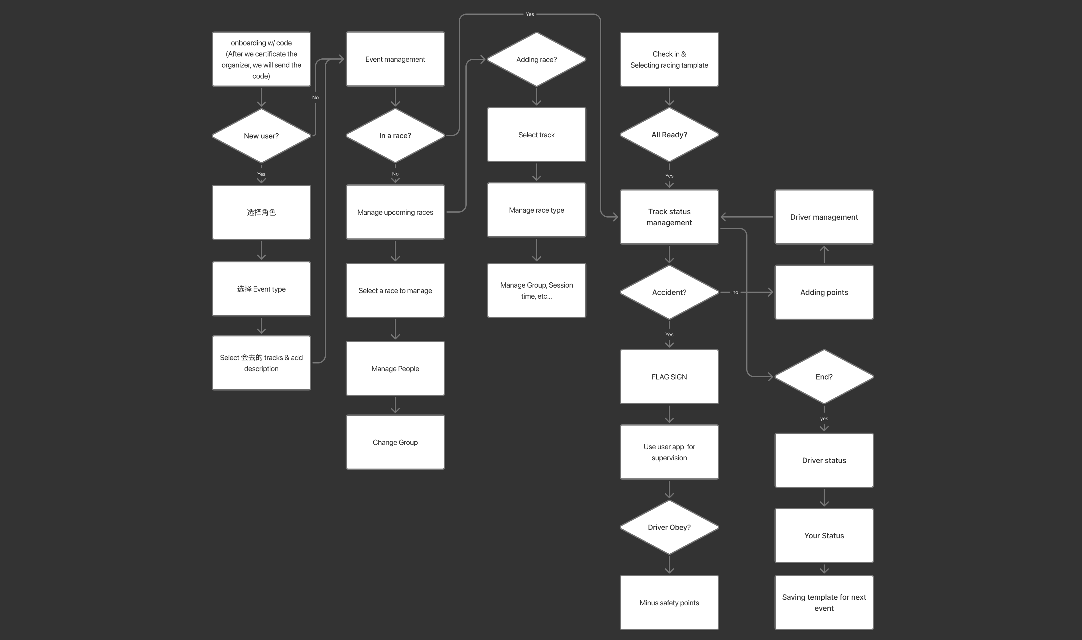
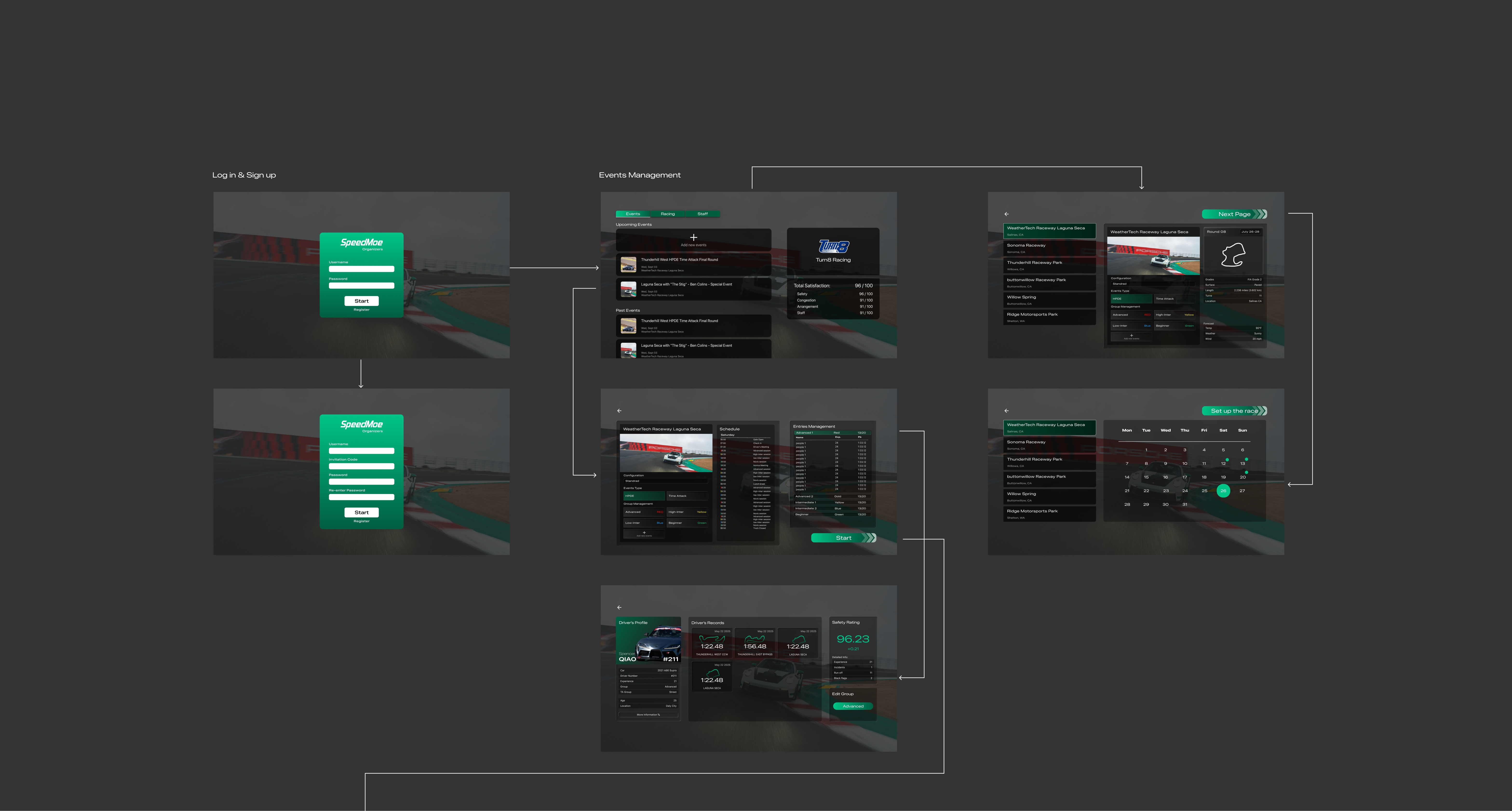
Re-considering the Organizer's System's Function
Considering the usage scenario, we developed the organizer’s system exclusively for desktop to ensure ease of use during live events. Functionality was prioritized over aesthetics, with a streamlined, flat design approach. All core features are integrated into a single page to provide organizers with quick, centralized access during race sessions.
Initial V1 UI

On-site Testing
We used RaceBox as our base device to begin on-site testing. This allowed us to verify that the data could be accurately captured and effectively integrated into our system. At the same time, we observed how users interacted with the app in real track conditions to evaluate the overall user experience and identify areas for improvement.
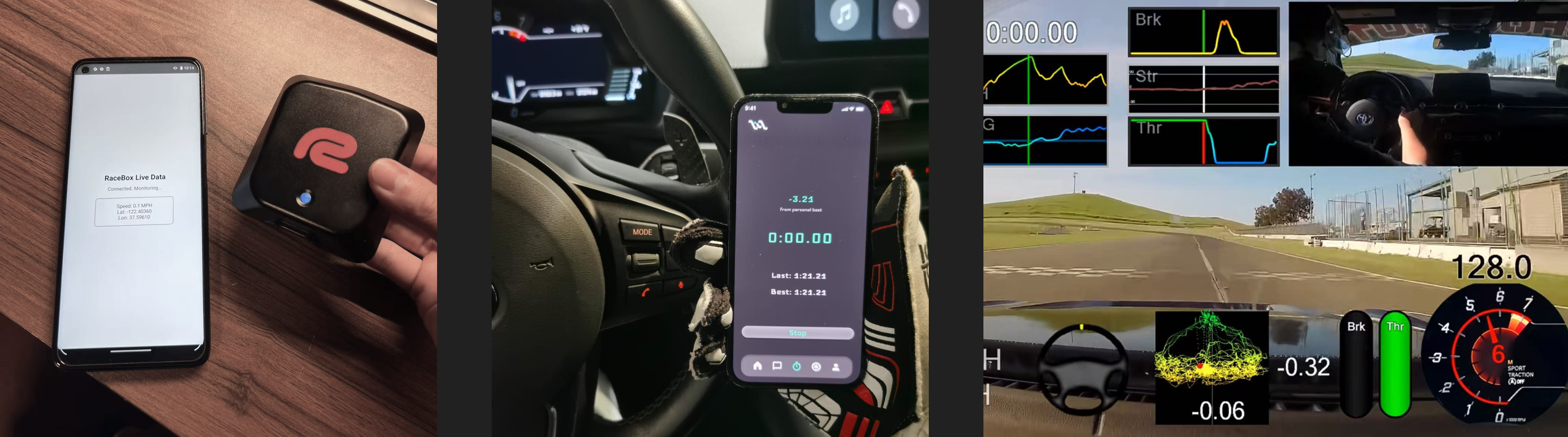
Takeaways
Timing Refinement

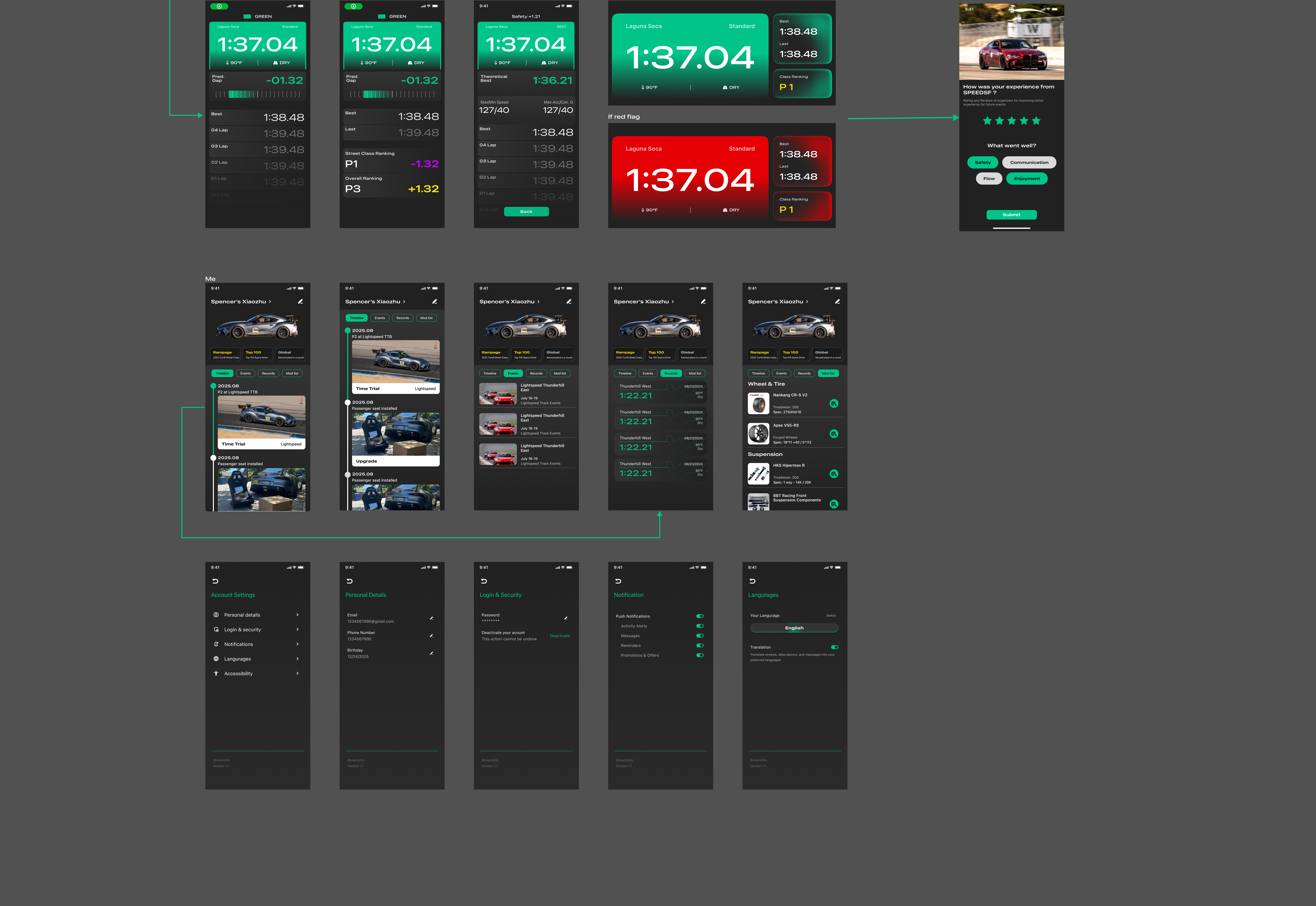
Based on user feedback, we made several key improvements to the timing interface. We enlarged the timing button to accommodate gloved hands and removed the bottom navigation bar during active sessions to avoid accidental touches. Now, after pressing "Stop," users are taken directly to the analysis screen, ensuring a smooth and focused experience.
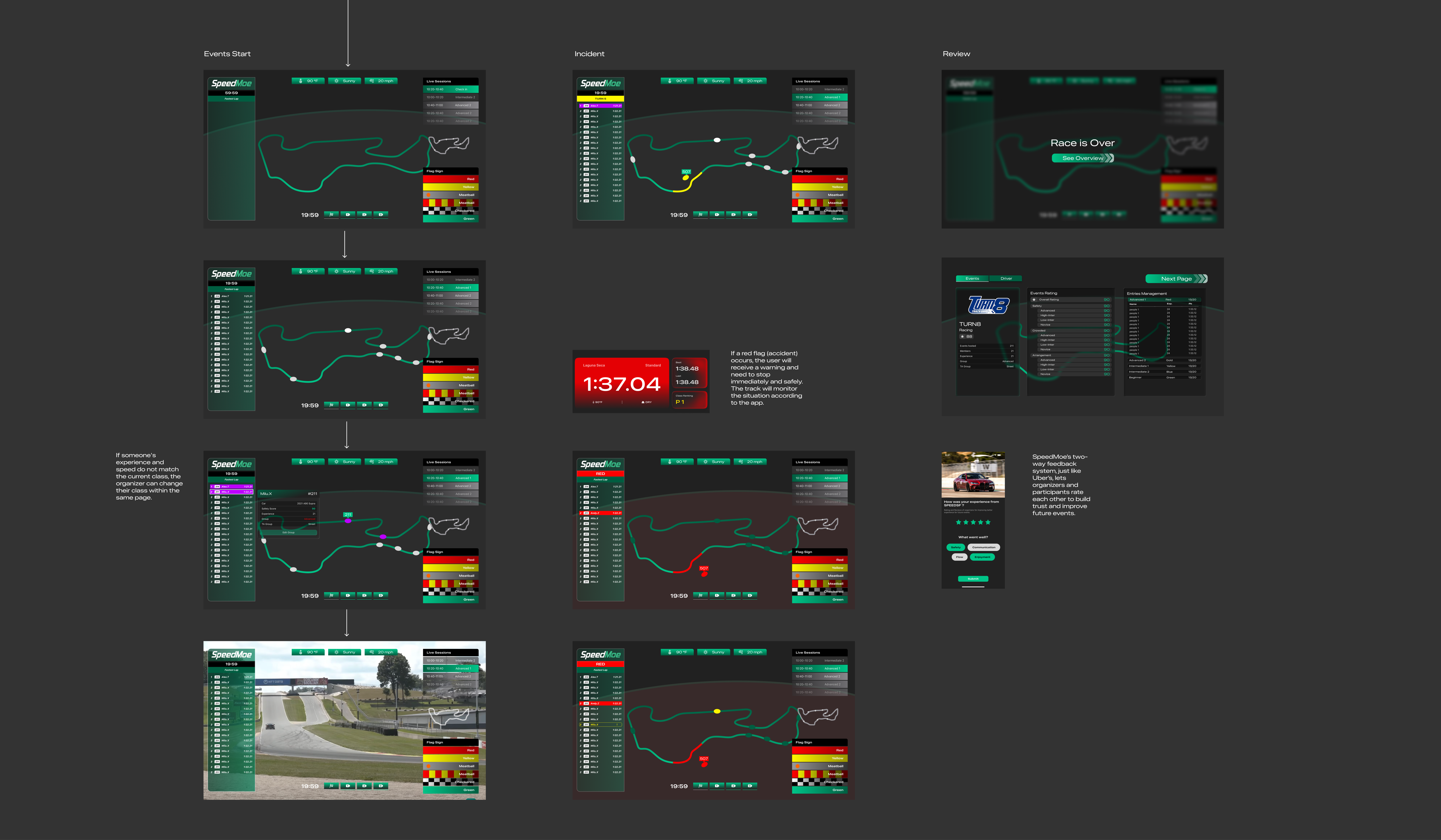
Emergency (Red Flag) Design
In the event of a dangerous situation on the track, a red flag will appear on the screen. To ensure drivers notice it immediately, we implemented a flashing alert that blinks several times before transitioning into the previously designed breathing animation. This combination enhances visibility without being overly distracting during high-focus driving moments.
Replace the bottom menu bar with AI push
Instead of a static menu, the homepage will dynamically adapt using AI. Based on user data—such as track day performance, real-time conditions during events, and the time since or until their next track day—the system will deliver tailored homepage pushes that keep the experience relevant and engaging.
Organizer's feature update
We need a B-side platform for organizers to control registration, grouping, scheduling, and safety, fully connected to the user-facing web and mobile app; for organizers, we have standardized the staff management list and operation pages, making everything more streamlined and accessible.
V2 UI update
Refocusing Resources: Discontinuing the C-side Website
After balancing development time and resources, and following careful evaluation through multiple usability and performance tests, we decided to discontinue the C-side website in order to focus on delivering a more efficient and optimized product experience.

Color Plate
We chose a dark gray and green color palette to evoke a sense of technology, precision, and motorsport intensity. The dark gray provides a sleek, high-contrast base, while the green adds energy, clarity, and a modern, performance-driven feel—perfectly aligning with our track-focused brand.
Theme color Inspiration

Typeface

We combined the racing flag with the letter "M" to create a simple, bold logo. It’s designed for versatility—easy to use in apps, print, and even making it noticebale on all kinds of sponsored car liveries in differnt color.

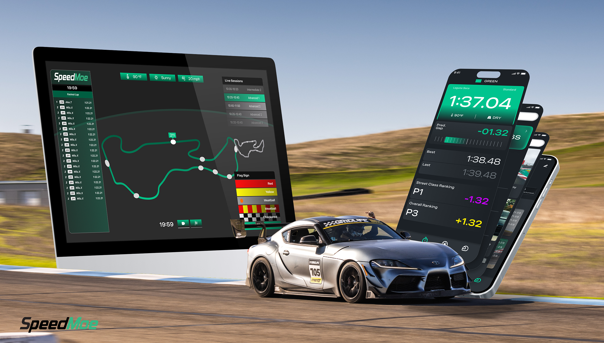
(Web + App + Track Integration)
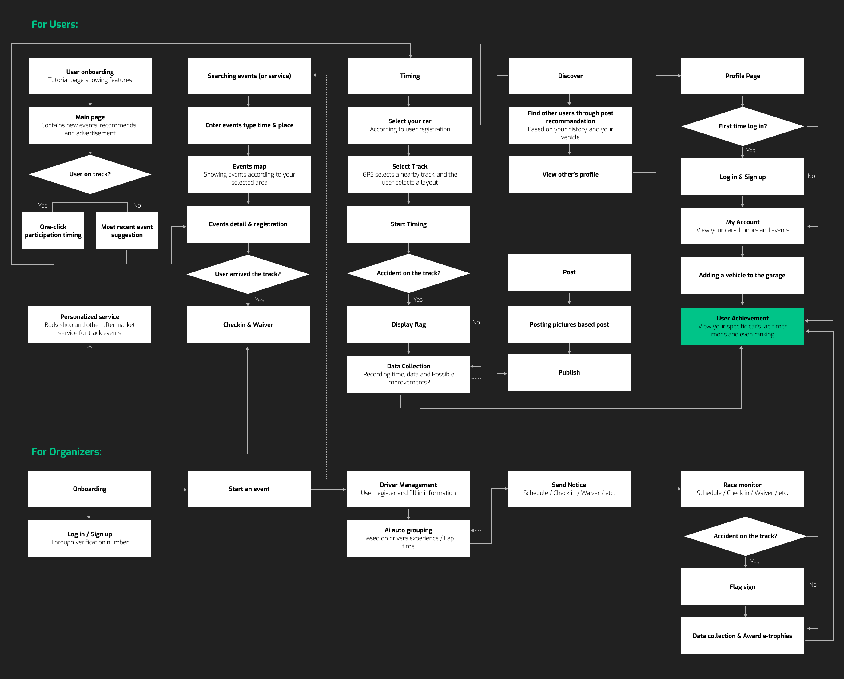
The final UX flow was built around real track day needs—from registration to live data tracking and post-session services. We prioritized clarity, responsiveness, and ease of use, especially during high-pressure moments on track.
For users, the design blends performance data, profile mods, and social features to create a connected, rewarding experience. It’s more than just a timing tool—it’s a racing companion powered by data, reputation, and engagement.

After discontinuing the C-side website, we plan to reintroduce a streamlined web client in later phases. This version will focus on core user needs such as registration, driver profiles, and event history, ensuring consistency with the mobile app while offering broader accessibility. The development will prioritize performance, usability, and seamless integration with the organizer’s B-side platform.
We’re preparing to launch our in-app store, where users can browse track-related products and services. The store will be connected to each user’s profile and mod history, enabling personalized recommendations and engagement. At the same time, we’re actively in discussions with potential partners to bring high-quality gear, services, and brand collaborations into the platform.
If you’re interested in collaborating, please reach out to us at dongyuc3@stanford.edu — we’d love to connect.
We are excited to announce our collaboration with Turn8 Racing as one of our first sponsors and also partners, and we are actively looking to bring more track organizations on board. This partnership marks an important step in building a platform that truly serves both organizers and drivers. Currently, the project is in its beta stage, where we are testing core features, gathering feedback, and fine-tuning the experience to ensure smooth coordination, clear communication, and safer, more engaging events. Looking ahead, we plan to continuously expand our features—from smarter group management to richer driver engagement tools—so that track days become easier to organize, more fun to participate in, and centered around what matters most: the thrill of driving.